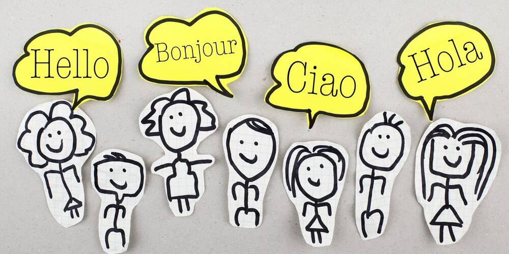
When it comes to the world of graphic design, staying ahead of the latest trends is a must. Let’s take a look at some of the best.
Contrasting typography
There is no denying the fact that this can be a difficult trend to pull off. Nevertheless, if you get it right the results can be truly astounding. This is a surefire way to ensure your promotional printing stands out from the crowd. What makes contrasting typography so difficult is the fact that you are essentially pairing completely contrasting fonts together yet you somehow have to make them fit. Finding the right balance is essential, and it’s definitely not a case of putting any old fonts together.
Unique paper selection
More emphasis is being placed on the beauty and uniqueness of paper stock at present. From the vintage lace effect to luxurious gold tickets; companies are doing all they can to win over consumers with more ‘high-end’ print pieces. The aim is not only to catch customers’ eyes but to enhance your brand image by displaying high levels of quality.
Outdoor banners are back with a bang
Outdoor banner printing is a great way to create interest in your business. Not only will you be able to appeal to a large number of people, but also, outdoor banners make a huge impact, and they are cost-efficient as well. Nevertheless, if you want your banner to be a success, you are going to need to avoid the common design blunders mentioned below.
A banner that is impossible to read
One of the biggest mistakes that people make is choosing a font that is too small. As you have much more space to use, a lot of people decide to fill it up with smaller text and graphics to include as much information as possible. However, if you do this, you really limit the effectiveness of the banner. Remember, the whole point is to appeal to people from a distance. Therefore, you need to choose a large and legible font.
Information overload
This leads to our next point perfectly — don’t cram in too much information. Stick to the basics. Think of the purpose of why you are investing in large format printing, and then make sure your banner achieves this goal. Don’t include anything other than necessary. Your banner should have one goal only. This — and this alone — is what your banner needs to focus on.
Everything blending into one
In addition to this, don’t make the mistake of choosing text colours that blend in with the background. Contrast is paramount if your banner is going to stand out from far away and make a memorable impact.
Poor grammar and spelling mistakes
Fnally, it goes without saying, but make sure you proofread your banner several times and get someone else to check it too. There is nothing more unprofessional than spelling mistakes!
If you can avoid the design blunders mentioned above, you can go a long way to making sure that your outdoor banner is a success!
Colourful and playful design
When emulating this design, you’ll need to use a bright selection of colours and basic yet playful fonts. Therefore, colour palettes incorporating everything from red, yellow, and pink to lime and turquoise are becoming a lot more common when making the most of print on demand services. This is the ideal graphic design trend to go for when you are trying to create a positive brand expression. The trend is all about generating feelings of hope, wisdom, and positivity.
Art deco
Another trend that is proving to be popular in 2020 is Art Deco. Art Deco is a contemporary design era that got its name from the modernism artistic movement that started after the First World War, continuing for almost half a century. There are two key styles that come from this era, which are experiencing a complete renaissance. The first is the streamlined organic forms that come from the ‘50s and ‘60s, which is a mid-century modern period, as well as the highly glamorous and ornamental designs of the ‘20s.
A lot of designers have already started to embrace the complicated line-work intense symmetry that comes from the best work of this era. This is combined with sharp metallics to create a truly stunning effect. We are also noticing that typography is very much being influenced by Art Deco trends. Sans-serifs are getting leggier and narrower, which is very much a nod to this design period. These designs feel luxurious and opulent, which is in stark contrast to the work that is rustic and country-inspired, which has dominated for the past couple of years.
2D design
In basic terms, flat design is essentially a reversion back to 2D printing rather than 3D effects. This is actually a trend that first emerged in web and app design and is now being embraced in print. Essentially, it means designers are moving away from the use of various textures, bevels, drop shadows, and other 3D features. The reason why this option is proving to be extremely popular is that it perfects the trend of simplicity beautifully.
Futuristic colour schemes and designs
Last but not least, we are going to see futuristic designs and colour schemes continue throughout the year as well. Futuristic-looking designs include the likes of neon blue, neon green, matte white, neon white, and matte black. Giving a nod to the future is something we are going to see throughout print marketing in many different forms across the year ahead.
So there you have it: some of the top print marketing and graphic design trends that are making an impact today. From colourful and playful design to marketing with outdoor banners; there are many ways that you can make your impact felt as a business in 2020.
Photo by Britta Jackson from Pexels